


Through internet access, artists and illustrators can access unparalleled sources and visual material to use as references for their designs. This, combined with an overall culture that sells the necessity of self-expression over all forms of cultural production, should theoretically result in an endless amount of illustrative styles available for all sorts of creators to draw upon. How is it possible, then, that most visual language pollutes our daily life, whether in official health announcements, public transportation, or advertising, to appear interchangeable, generic and flat?
Advertisement and overall graphic design deserve serious consideration and scholarship. What is often dismissed as frivolous and unworthy of appreciation due to its consumeristic nature has attracted artists who instinctively understand the potential of mass communication to showcase their abilities and taste. Art and advertising have an overlapping history. A few examples are some of the Surrealists’ most prolific names, such as Rene Magritte and Salvador Dali, who both designed posters and commercial items, respectively. Andy Warhol is perhaps the most crucial case study of an artist who did not shy away from mass communication and its potential. They mastered the ability to celebrate popular culture and high art as interchangeable and fully embrace commercialism as its unique artistic force resulting in Pop Art.

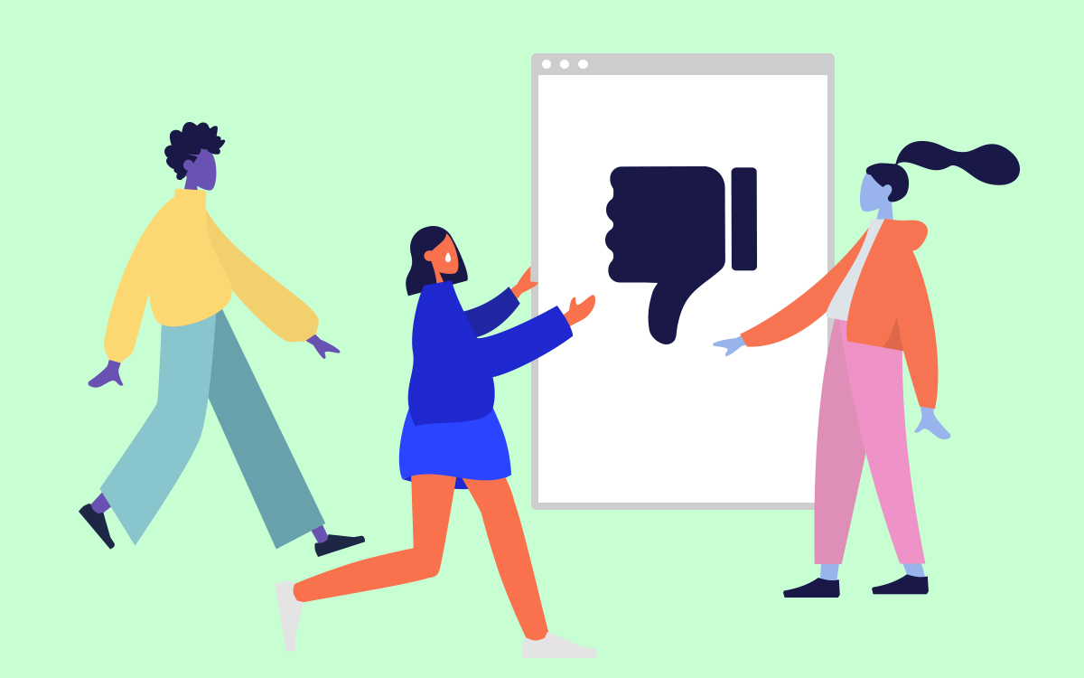
The figures float in the air against a monochromatic background. There is no shadow or perspective, alluding to a lack of specific time and space. Anonymous faces hint at no emotion except a white tear that functionally reminds the user of the ''unlike'' feature. Source.
Still, this plurality of exciting visual designs is nowhere to be found across our cities’ billboards, shop windows and official information. The first answer that might come to mind is that we are in a moment where forms of minimalism are privileged, and our culture may be in a modest phase where eccentric and provocative aesthetic projects have come out of fashion. Perhaps a sense of sobriety and modesty is to be expected from governmental communication. Yet, the same flavour of minimalism is also to be found in corporate settings far from the enthusiasm and colours of previous eras. A more complex and relevant answer to this phenomenon is the influence of the visual language referred to as ‘Corporate Memphis,’ or in denigratory terms, ‘Globohomo’, which stands for global homogenisation. The name refers to the Memphis Group, also known as Memphis Milano, an Italian design and architecture collective founded by Ettore Sottsass. From 1980 to 1987, the group designed a series of objects and architectural applications including lighting, fabrics, carpets, ceramics and furniture, whose main elements incorporated plastic laminate, glass and metal. The Memphis style is characterised by bold colours, geometric and often asymmetrical shapes with abstract, excessive decorative touches.
To deny the internet’s impact on graphic design and illustration is foolish. There is a lot to be said about the fact that, both materially and physically, we are far from the days of how the Surrealist and the Pop Artists produced art. The technological potential offered by graphic design, illustration software and the internet is endless. Nonetheless, it has also caused the homogenisation described here, and a turning point in its history is Facebook’s 2017 visual rebranding. What is explored here is an artistic development that tells of broader phenomena at the intersection of Tech companies, their ideological values and overall political aims that are also very much aligned with liberal and progressive sensibilities. It would not be an exaggeration to suggest that smaller companies and entities have absorbed such a style to signify their allegiance to these values.

Corporate Memphis turns movements into festive and abstract routines. Limbs are exaggerated, suggesting a joyful extravaganza in using a company's platform. Source.
Corporate Memphis and its origin can be traced to an American design agency, Buck. In 2017, Facebook commissioned a series of illustrations and animations for its website and app that could give a distinctive and figurative touch to its content. Buck delivered a style guide called ‘Alegria’, a Spanish word for joy, which resulted in being the template for the endless and interchangeable images we are all accustomed to. Apple made another significant change that deserves mention in 2013. Since the conception of digital logos and designs, interfaces have often used a style called ‘skeuomorphism.’ Compared to now, this aesthetic featured shadows, layers and different visual techniques. Digital buttons and icons were meant to resemble three-dimensional, physical objects.
In a similar rebrand, Apple changed its visual elements of skeuomorphic and replaced them with a flatter, minimal interface. As a result, graphic designers and illustrators followed through and focused on delivering what is referred to as flat design. The flat design follows the principle of replacing complex logos with a more minimalistic presentation. It enormously impacted corporate settings where most global brands have revamped their aesthetics to follow this trend. Functionalism plays an essential role in the spread of this style. One of tech design's pillars is facilitating the user’s experience with these online platforms. One of the main goals of flat design is to ensure that all visual elements across different-sized screens will adopt and retain their format. This style is, therefore, convenient, and it serves multiple applications. When it comes to graphic design, these illustrations are easily worked with, making it possible to generate endless animations, sizes and replicas. There is also an economic incentive, as designers are often forced to deliver multiple projects with little compensation. Unlike the affluence of certain tech spheres when it comes to designers, their budgets are limited, and so is their allowed time to work on their illustrations. Their embrace of the minimal, flat design reflects a broader trend of devaluation of art practices. Additionally, aspiring clients from all sorts of businesses who wish to project an image of respected, established and severe enterprise will look at what more prominent tech companies do to emulate their style and hopefully attract the same success. When it comes to design skills, this shift also reflects the impoverishment of skills and practices that seems to afflict designers who struggle to come up with successful alternatives and unleash heterodox creativity.
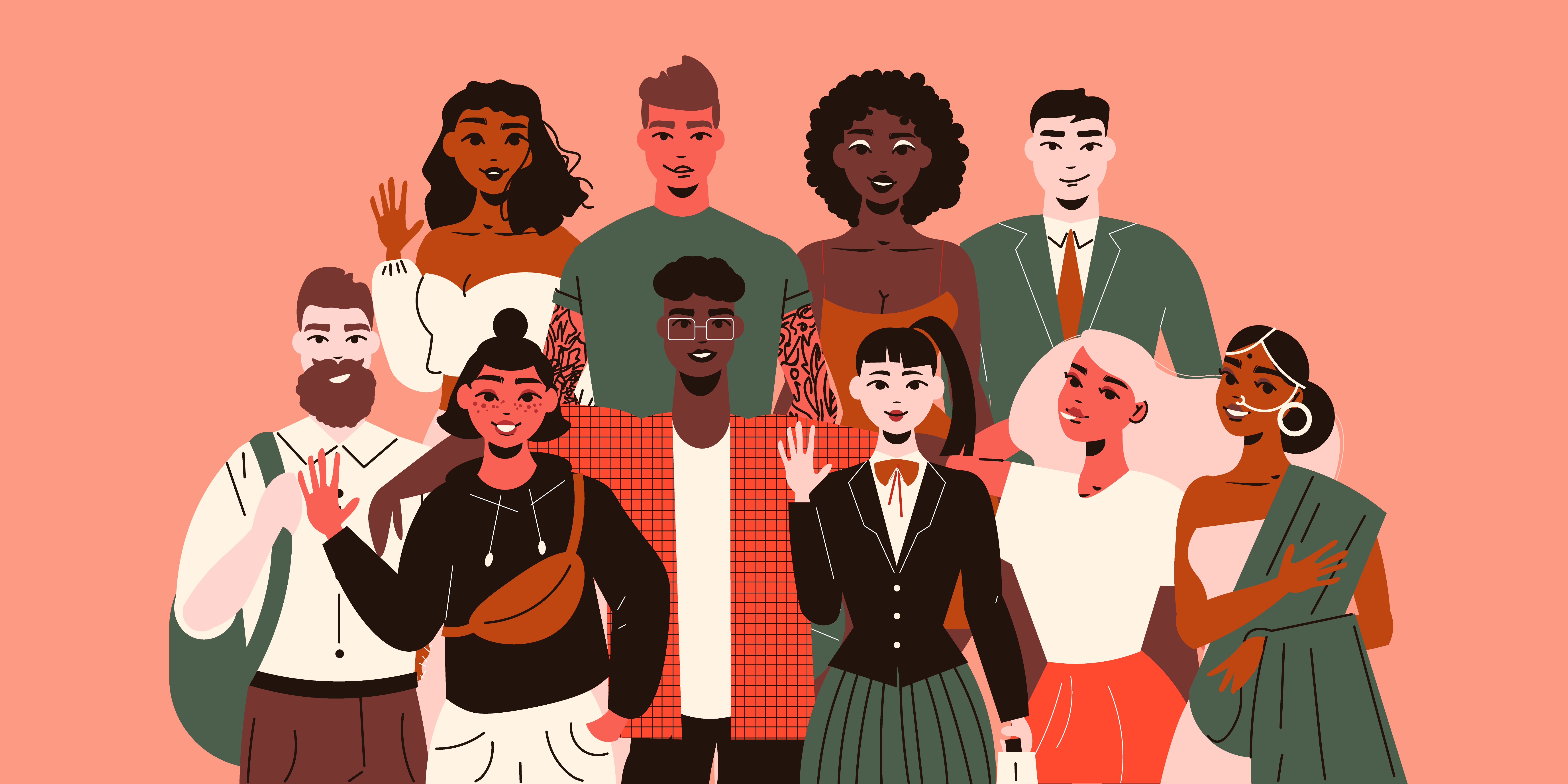
This style evolved and aimed to depict global citizens and represent diversity and inclusion, one of the core values of international companies. Visual differences amongst consumers are less abstract and suggest cohesiveness brought by participating as consumers. Source.
How does corporate art present itself, and what is Alegria’s impact?
A standard design depicts a smiling person drawn with no references to shadows or proportions in a flat, minimal style. These characters feature pastel-coloured skin ranging from blue and green to pink. Their limbs bend in great curves and always appear in motion; these figures run, dance or hug one another. They appear over-expanding and overreaching with no static size, resulting in a series of encounters of camaraderie and joyful exchange. Such style is easy to replicate as these cartoonish characters are based on basic geometric patterns and easily drawn shapes. Quickly these quirky, unremarkable and inoffensive characters could be found anywhere, from train stations and bus stops. A case example of this is Transport for London’s design. Its original style is emblematic of the overall Modernist enthusiasm enriching public life. Even so, this has been replaced with Corporate Memphis. This style has become distinctive for large tech companies and small startups, which ambitiously signal their aspiration to one day become as big as Facebook.
Personal and distinctive human references are nowhere to be found, which is no coincidence. These characters were initially depicted with no relation to the ethnic background as one of its central ideas is to offer consumers the possibility to see themselves engaging in such simple activities. This quickly changed, and other tech companies have decided to signify their participation in the progressive values of diversity and inclusion. An example of this can be found in the words of Jennifer Hom who wrote on a page dedicated to Airbnb and its design;
Western-centric, outlined cartoon people need to change. Diversity of age, race, disability, religion, orientation, and gender are the foundation of who we are. We need to reflect belonging anywhere, and my role was a clear opportunity to celebrate diverse identities.
Hom is explicit in stating that her visual research focused on representation. Her aim focused on developing characters representative of different ethnicities and concerns found within identity politics. In her words, she appears to criticise previous tech styles, such as Alegria, as not being inclusive enough. Despite admitting that rainbow-coloured characters are meant to be a sign of inclusion, her mission went further and attempted to capture ‘reality.’ As a result, her research method consisted in using photographs to avoid stereotypical representations and ensure what she refers to as ‘authenticity She states;
A solution that many land on is a kind of homage—a metaphor for diversity through rainbow-colored figures. They’re often the same body type and age, but colored in red, blue, yellow, orange, purple, and green. Put simply, they’re not real.
If Corporate Memphis’ homogeneous appearance results from a combination of economic and software factors, ideological reasons for adopting this style can also be found in these companies' overall public relations strategy. This visual language is meant to signal connectedness, trust and safety. These illustrations are a vital strategy to push for this utopian narrative that can often mask and brush over more sinister technological applications of the global companies we are familiar with. Multinational tech corporations are highly invested in protecting an image of harmless, approachable and connectedness to avoid criticism regarding the political implications of how their businesses work. Some may even suggest that this imagery is misleading and deliberately oversimplifies some of the impacts of giving up personal information and comprehensive consumer data in exchange for their free services. There is a disconnect between the false sense of security and friendliness that completely ignores a long list of scandals, including data mining, censorship and shadow-banning, which disproportionately affect users and organisations making political statements in the name of freedom of expression and the commitment to overall heterodox culture. Whether it is Edward Snowden’s leaked revelation of domestic spying in the United States or the infamous suppression of the New York Post’s article on Hunter Biden’s drug consumption, which Facebook’s Mark Zuckerberg has admitted to being instructed by the FBI to suppress, these platforms are far from apolitical and neutral. Corporate Memphis’ childlike figures serve as a playful distraction.
The utopian world that Corporate Memphis portrays is a globalised, overreaching culture of anti-individualism and interchangeability. This is also deliberately clear regarding how consumers are perceived, not as being inserted in any precise location with its cultural fabric but as a floating being with no reference to distinct characteristics. It is, therefore, too simplistic to dismiss this style as simply bland and inoffensive without noting the conscious attempt at pushing specific socio political values in line with globalised and homogenised projects, hence the name ‘globohomo.’ The French anthropologist Marc Auge coined the term ‘non-places’ to describe a physical space where unconnected individuals with no shared culture or sense of a public sphere commute or perform a consumeristic activity. These places are characterised only by their functionality and represent the pinnacle of globalism due to their similar architectural appearance and purposes. According to this premise, this functionality must be restricted to consumerism; airports, rail stations, metropolitan stations, supermarkets, shopping centres, fast food courts and highways can be defined as “non-places' '. If traditionally a place is identified considering its geographical location combined with its historical identity, a “non-place” offers a homologated identity where individuals’ behaviours are identical and repetitive. In these areas, a particular stage of anonymity is created, in which people are bound to a constant and inevitable interaction that does not establish meaningful connections between them.
Auge identified a new form of isolation in these global “habitats”. Cities are divided and built on connections that systematically force humans to move from one “non-place” to another. Contemporary cities share similarly structured webs of transportation divided into “non-places” in which the masses move in their shared loneliness. This results in what is described as a “super modernity. For instance, despite the geographical location, airports will most likely look similar in every country where this form of “super modernity” is present. Similar traits and characteristics will be present to guarantee the easiest possible transition between the place of departure and the place of destination. Comparable to this it is noticeable that regardless of which city is taken into account, suburban areas look similar and offer related services. Chains of supermarkets pre-design a set of architectural infrastructures that need to be copied and pasted according to the size of the land that was previously bought on where they wish to build on. A “non-place” is entirely built on its functionalism, and therefore aesthetics, designs and accessibility are decided exclusively on its purpose; they need to be autonomous and effective.
Corporate Memphis has been adopted as the style of all non-places, but it increasingly spreads to healthcare providers and official government communications. A visual language that aims to inform, educate and propagate political values of inclusivity and diversity. Ironically, this has resulted in all visual language being saturated with images referring to only one version-controlled diversity, which completely ignores and suppresses geographic identity's historical and organic development. Corporate Memphis’ utopianism relies on providing endless instructions and soft demands that may appear innocuous and neutral but are not.